

Mobile Friendly Websites
Visitors who access your websites through mobile devices are happy as long as they can easily move around, get the information they want, and enjoy their visit.
Great mobile websites should still be visually inspiring, easily navigated, not need shrinking to view the entire page,
and function in much the same way as the website does on a desktop.
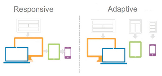
Responsive WebsitesResponsive Website Design (RWD) is the method I have previously used and was Google's favourite. It works on the principle of flexibility - a single fluid website, using only one set of instructions (a css style sheet) to display the website. The style sheet is coded so the website displays correctly on any device. Responsive websites flex and change based on a multitude of factors. The website should shrink and expand to fit the device being used to view it, and should 95% display the same on Desktops, Laptops and smaller devices.
Adaptive Websites - My ChoiceAdaptive Design is "mobile first" design I now use and is based on the fact people use smaller screens over laptops and desktops to access the internet. (Google calls this dynamic serving) uses multiple sets of instructions (css style sheets). Instead of one flexible design, adaptive design detects the device/screen size, and then provides the appropriate style sheet to display the website. This means multiple options for display must be built into the website.
Mobile m. WebsitesA separate Mobile website (m.dotcom) with the URL m.yourwebsite.com can be built specifically for mobile devices. This website is not used for Laptops or Desktops.
Sacred Spaces packages include full mobile adaptive websites. Costs reflect the difficulty and time involved, and if you website is larger than standard or more complex, the cost may be more than the standed price listed in the Terms and Conditions. I Recommend
I Recommend

MALWARE - STAYING SAFE ONLINEHTTPS://DOMAINS and HOSTING
MY WEBSITE
WEBSITE CODE and SEODEFINITIONS |

|
Copyright 2012-21 - neriKdesign
Wordy Birdy Writing Services |